Continuing the look at the TV Calendar Update (coming ASAP!), the summary page gets one of the bigger changes on the site. Not only does it look more different to the "old" page than the update of the Homepage, it incorporates new features and functions, and under the hood, a completely novel layout paradigm! Read on to find out more.
You can help with the development of the update with a Lifetime Premium Account, get new backgrounds and an Ad-Free experience - Just £81.00 until Cyber Monday!
https://www.pogdesign.co.uk/cat/go/2025-cyber-monday
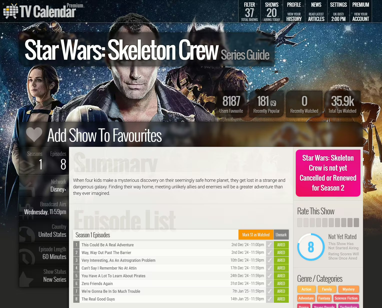
First up, it's easy to see where the designs share ideologies, and which bits have moved around. The background image is more visible, bleeding around the edge of the information, which now stops growing wider at about 1600px. The current version was made for 1920x1080, but monitors are increasingly 2560px and wider - I'm sat in front of two 43" 4K screens. This causes a lot of white space that doesn't look great. The new "more compact for more people" looks more solid and cohesive.
The show data column to the left is now how I imagined back in 2012, but making stuff alpha was difficult enough, let alone the frosted glass effect. As part of the better feedback of elements, these now slightly light up when rolled over. The real star of that area though is the favourite heart now "beats" slightly when you add a show to your filter.
Shows, and episodes, and probably seasons by the time of release are now able to be rated. This data will then be visible to you, to be searched on (even by genre etc), to be shareable, there's a new world of possibilities. Not finished in time for these screengrabs, adding shows to lists will also be enabled, that can be searched through and shared with your friends.
Want to discuss your favourite shows and episodes with other like minded avid TV viewers? Or help others to find new shows to watch by marking your post as a bone fide review, which will automatically add your rating score to the publicly viewable post - just don't forget to mark it for spoilers - we want to help the community, not ruin everyone's enjoyment in new TV.

Another new load of data, main and full castings for shows. These will be searchable too, which is why as discussed in the previous post about the Front Page, the search function is moving to its own dedicated page. It's possible in future that you'll be able to add every show that stars your favourite actor with one click, amongst other planned ideas for this data.
Genres now gets a decent makeover too. Currently a show is limited to one genre, which you can click through and see more shows in that same category, but that's a bit basic. There are now 121 Genres / Categories, and from the listings page for those genres, you'll find the ability to drill down through multiple categories. Want to find a Sci-fi Action Comedy with Robots? It's now just a few clicks away. But, a heads up, it's Futurama. Go watch it!
Similar Shows are now organised in more helpful card-like sections - with more information at your finger… er… eye ball… tips. Well, that was gross. These cards are used around the TV Calendar, again giving a more cohesive feel across the entire site. There's also a Franchise area for the shows that can be grouped as such, again giving more access to more shows that you might actually want to watch.
For the rest of the page, headings are now simplified but enlarged, giving clearer subject areas. The episode listing / drop down looks the same, but the CSS is completely different and more solid, and the control JS is… on another level. You can now click shift any number of episodes to mark them off as a group, and for a bit of visual flair, the ticks will enable in the direction (ie up or down) that the shift click occurs. Very useful!

Once again - you can help with the development of the update with a Lifetime Premium Account, get new backgrounds and an Ad-Free experience - Just £81.00 until Cyber Monday!
https://www.pogdesign.co.uk/cat/go/2025-cyber-monday